Join the Dark Side of Visual Studio
UPDATE: THIS POST HAS BEEN MOVED TO MY NEW BLOG! Please redirect your bookmarks here:
http://weblogs.asp.net/infinitiesloop/archive/2006/08/06/Join-the-Dark-Side-of-Visual-Studio.aspx
Visual Studio is without a doubt a powerful tool. With every iteration, it continues to improve upon itself. But as you happily hack away at all your applications, you are blistfully unaware of it's evil dark side that has been there since the beginning. It's true.
There are those of us who embrace the dark side. But we are out numbered...
You see, the dark side isn't how it comes by default. No... it comes all happy and bright and cheery by default, and like good little jedi programmers you accept those defaults. But the dark side is there, hidden away deep within the environment settings, reaching out and corrupting those programmers who are corruptible. Why some are corruptible and some are not is a mystery that may never be solved, but each and every programmer must give pause and consider the benefits it provides.
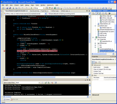
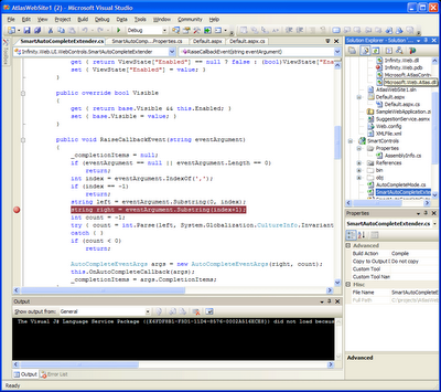
I know what you may be thinking. It's hard to read. Are you so sure about that? Lets compare it with the happy cheery default color scheme:
The key difference of course is the pervasive black background color. This is the environment I and many others work in every day. For me, it started way back when I used a Borland C++ IDE that had preset environment color schemes. One was called Twilight, and it looked similar to this. That color scheme was even my inspiration for this blog template (albeit it is only a variation on a standard blogspot theme, I'm ashamed to say).
Most people who see it for the first time are offended by it... but if you think about it, it really makes sense. It brings balance to the force.
The default scheme sports a bright white background color with dark text over it. But monitors these days are brighter than ever. You're presumably a programmer, so you've no doubt had those late but productive coding nights, nights that are lit by only the glow of your monitor. The glow is bright enough to light up the room and cast shadows. Not unlike... a light bulb.
So there you are, staring straight into a strong light source, looking for the few pixels on it which are not illuminated. Can you read the wattage and manufacturer letters on the head a light bulb while it's turned on? Ahhh... but what if the bulb were black, and only the letters on it were illuminated?
 |  |
This bulb has no markings, but you'd bet they'd show up nice and bright and easy to read in the right image.
It seems to me the only reason a black-on-white background is so standard is because the GUI was invented to be an analogy to pen and paper. Paper is white. Your screen doesn't have to be.
Want to join the dark side? Click here to download my VS2005 environment settings. Just import them via the Tools->Import and Export Settings menu. Don't worry. If it doesn't suit you, just revert :)
If anyone is interested I can export VS2003 settings as well, but it requires an add-in since VS2003 doesn't have an import/export feature built in.
Happy coding!
UPDATE 06/19/2006
As requested... To enable exporting/importing styles in VS2003 you need an add-in called VSStyler, which you can download here:
VSStyler Add-In for VS2003
Once you have the add-in, download the dark side style export here:
The Dark Side for VS2003


13 Comments:
Proud to be a member of the dark side. . .I love your "staring into a light bulb" analogy. Thanks Dave!
it would be nice to change other windows background color. Now some windows are black other white.
I agree... unfortunately not all of the windows can be changed in that way :(
Hi Dave
I love this, sounds great, like to use it. I am working in VS2003, would like to know how to set the same, can you please help me.
Thanks
Kiran
Not a problem... to enable exporting/importing styles in VS2003 you need an add-in called VSStyler, which you can download here:
VSStyler Add-In for VS2003
Once you have the add-in, download the dark side style export here: The Dark Side for VS2003
Thanks a lot Infinity, I am using this style now. It looks odd now, hope it gets better after I use it for some time.
Nice color scheme. I have just joined the dark side.
Hey, it even saves the battery life of my laptop! :D
Cheers
I hadn't thought of that benefit, but its a good one! More battery life = more coding. Thanks for the comment :)
Dave,
Good color scheme, I increased the font size to 10 but other than that it works great for me. It's been so long since I've used a color scheme like this that I hope I don't start throwing VI commands at VS.NET 2003
Thanks,
Russ
im using this scheme even in visual studio 6.0
black background looks more relaxing to me than white background.
anyway, nice blog
The folks at Meebo know the dark side.
http://www.flickr.com/photos/meebo/48448622/
The force is with me again.....
It's hard to find the path to the dark side after a damn MEMORY JEDI makes my system off and needed reinstall. But the true sith never quits and with master google I'm back in the true path of the power.
Thanks a lot for your work, my eyes apreciate that.
Brazillian Sith Lord
David Levitt knows the dark side.
http://davidlevitt.com/2006/06/16/trying-out-the-dark-side.aspx
Post a Comment
<< Home